TENGA Lotion
EN
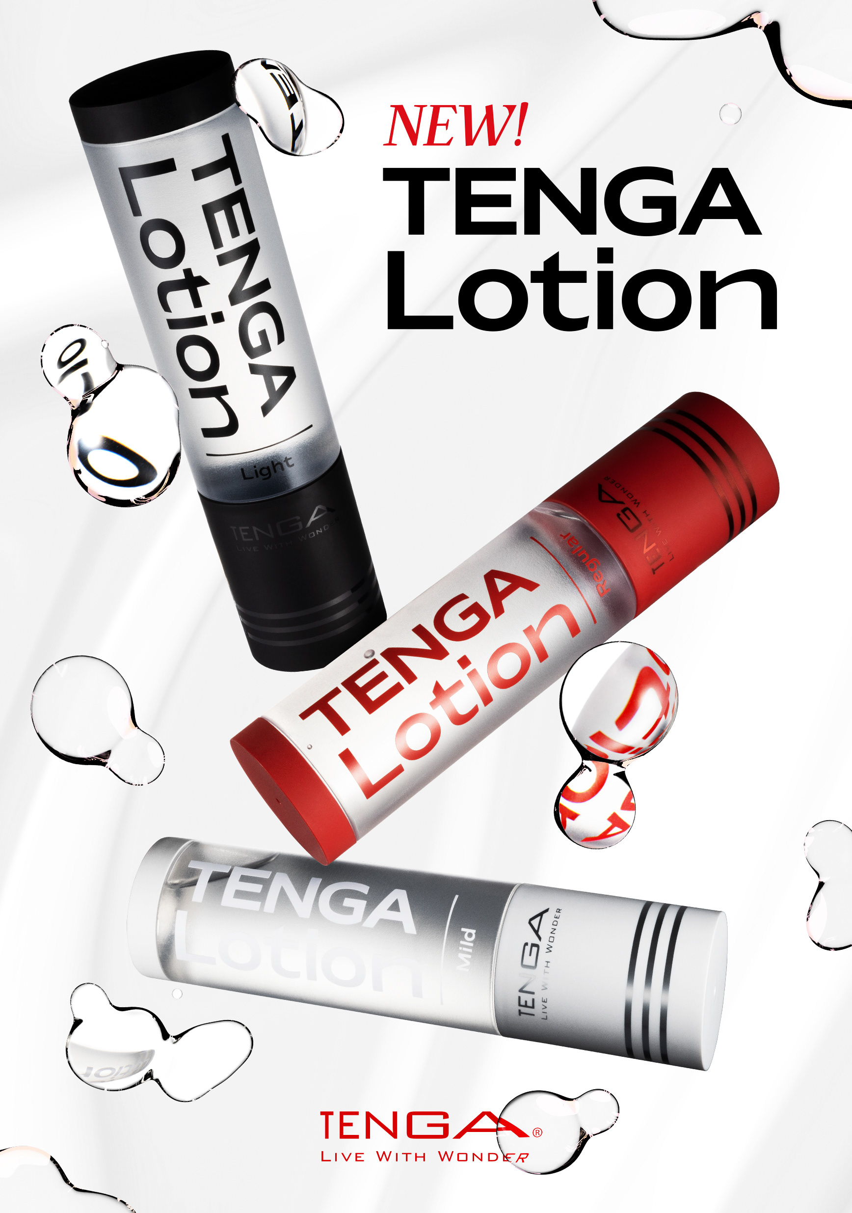
I was asked to give a new fresh look to the graphic design of TENGA Lotion’s packaging and lead the art direction of the multimedia campaign.
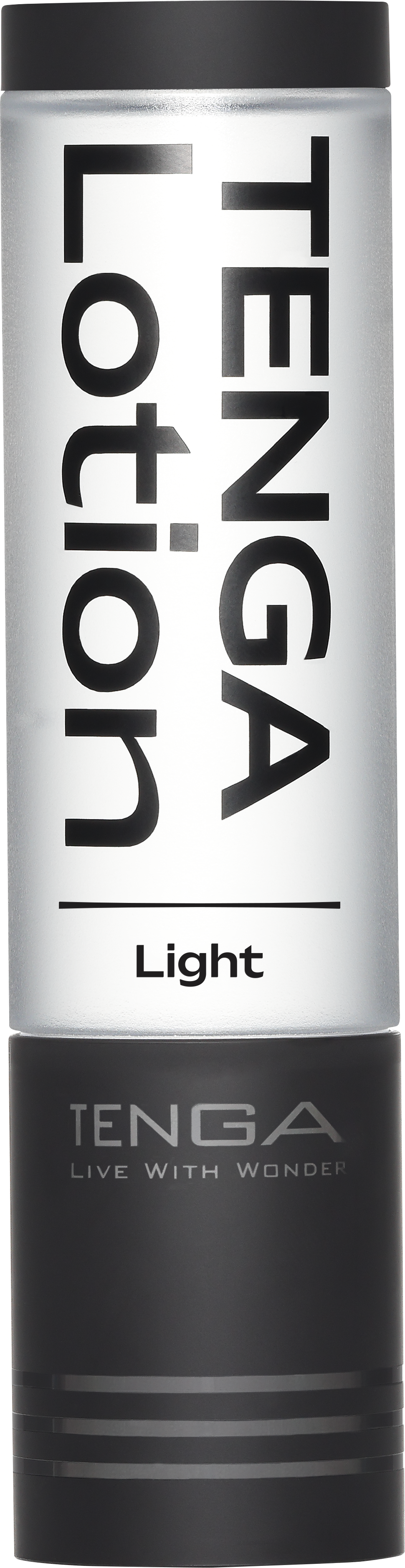
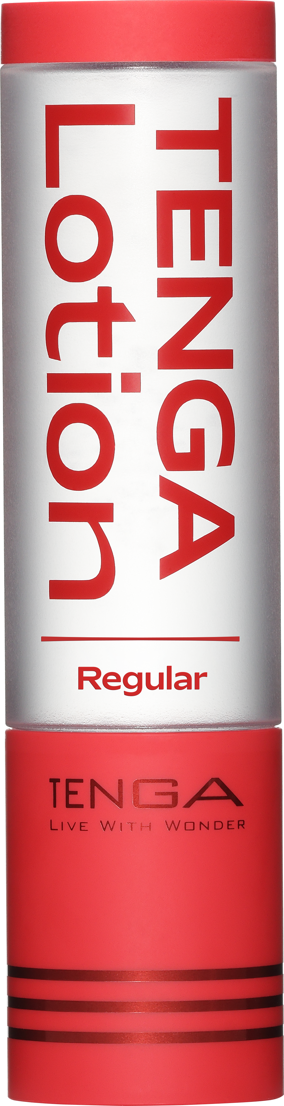
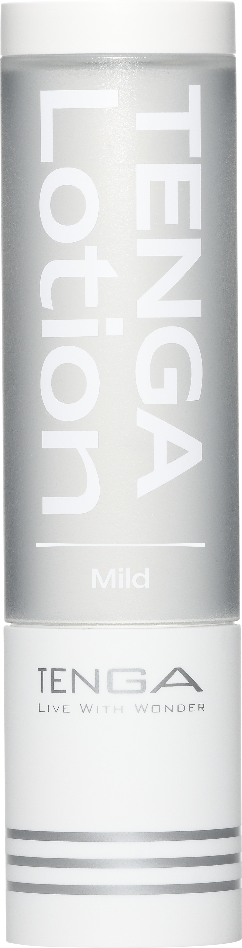
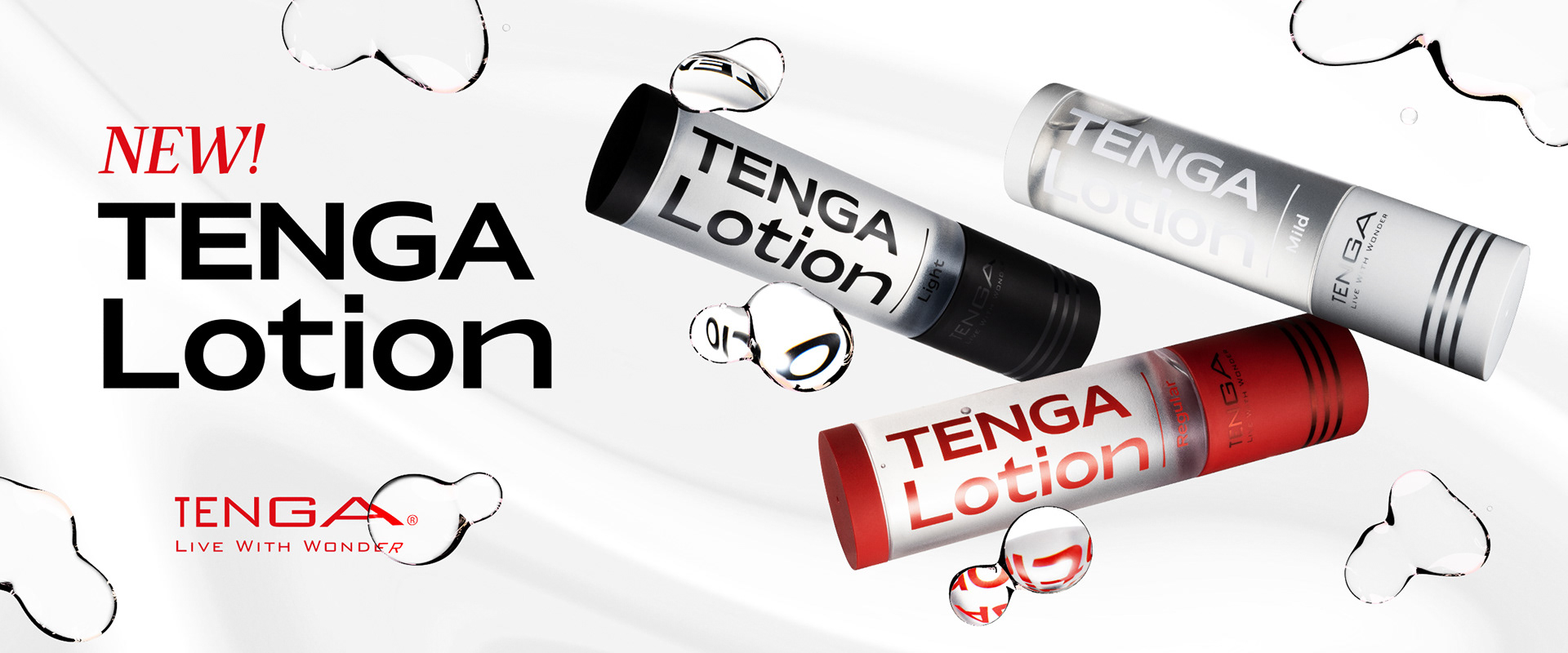
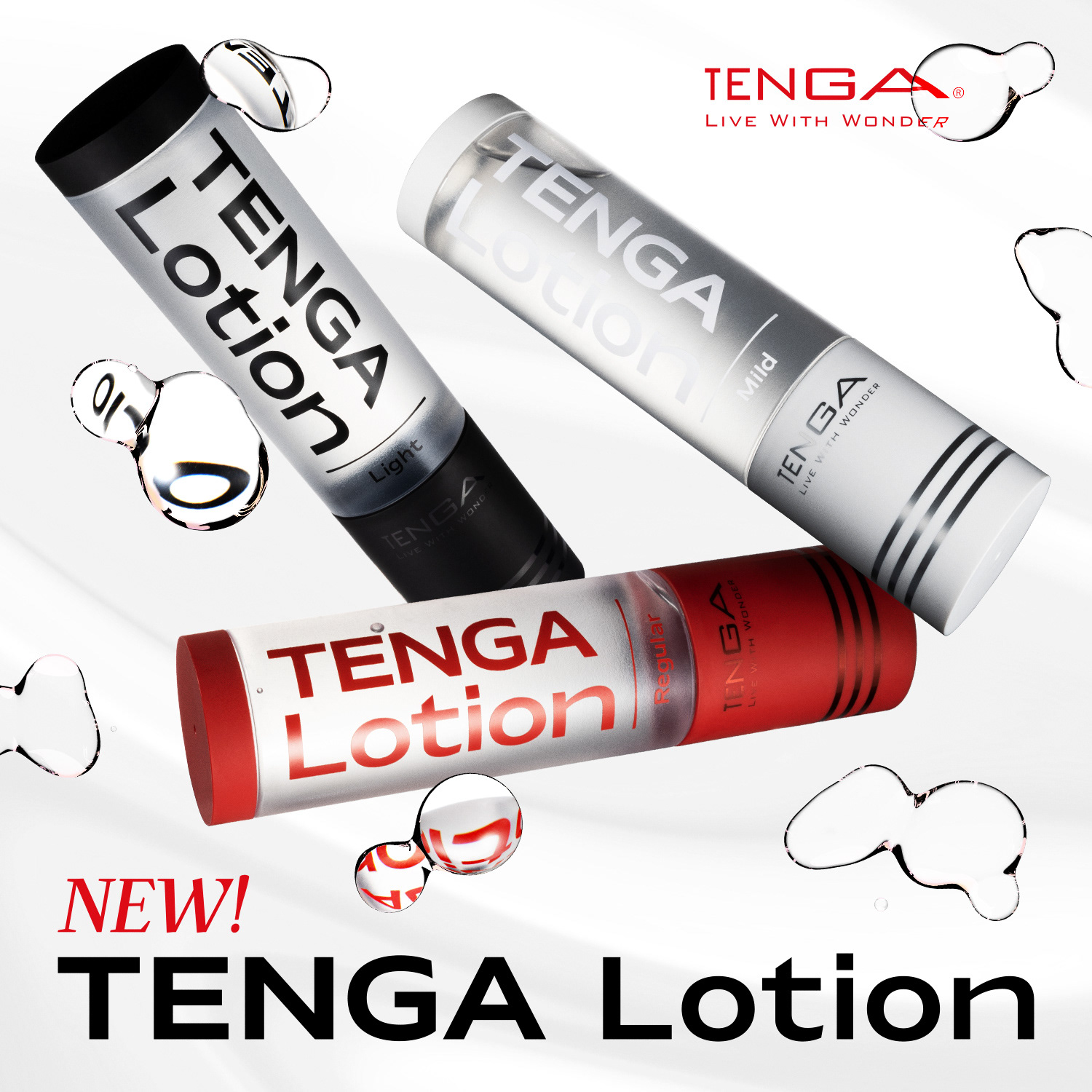
To highlight and link with the product characteristics, I chose a clean logo design featuring a wide sans-serif font. The logo appears on a matte-transparent surface of the container, which ensures readability against busy backgrounds. For the lower part, I highlighted the graphic elements with metallic finishes on a matte surface to create a compelling contrast.
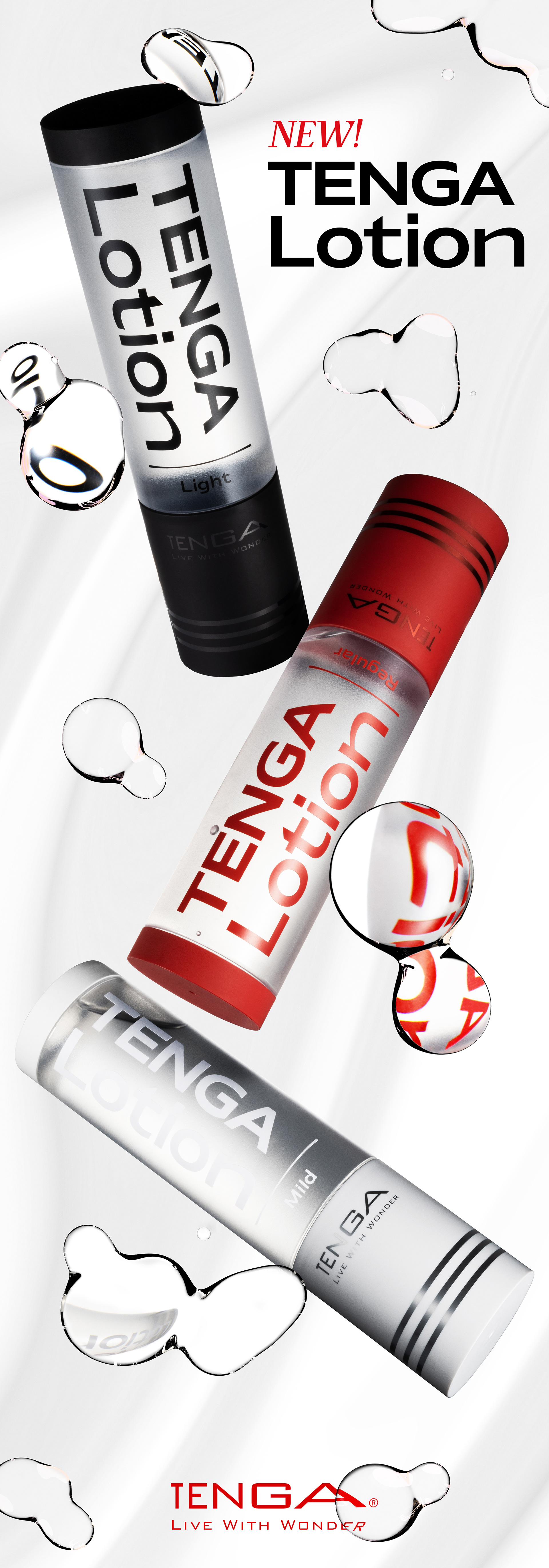
For the campaign’s visual, I created a design featuring the packaging design refracted in the lotion bubbles.
For the promotional video, I envisioned showcasing the formation of Tenga Lotion and other products through floating lotion bubbles. My idea was to create a dynamic video that also highlights each product's features.
•
日本語
TENGAローションのパッケージのグラフィックデザインを一新し、マルチメディア・キャンペーンのアートディレクションを担当することになった。
製品の特徴を際立たせ、リンクさせるために、幅広のサンセリフ書体を使ったクリーンなロゴデザインを選びました。ロゴは容器のマットな透明面に表示され、背景が賑やかな場合でも読みやすさを確保している。下部は、マットな表面にメタリック仕上げを施したグラフィック・エレメントを強調し、説得力のあるコントラストを作り出した。
キャンペーンのビジュアルは、パッケージ・デザインがローションの泡の中で屈折するようにデザインした。
プロモーション・ビデオでは、化粧水の泡が浮遊することで、テンガローションやその他の商品の成り立ちを見せることをイメージしました。各商品の特徴をダイナミックな映像で表現することを考えました。
•
The Packaging Design
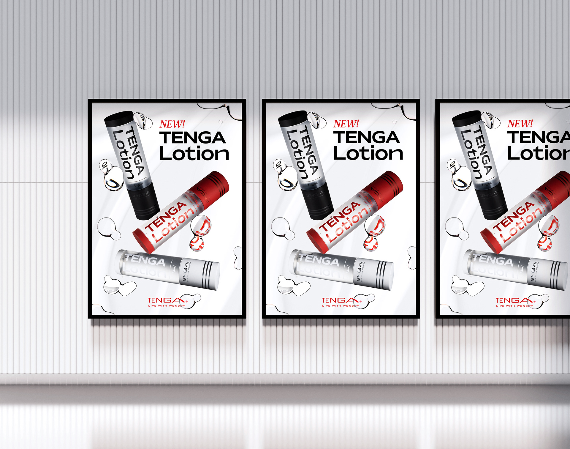
The Posters & Banners
The Promotion Video